Rebuilding and design consistency across the Faern Resorts.


Faern is a boutique Swiss hotel collection comprising a main collection site and four distinct property sites. Initially brought on to align the brand and UI/UX, my role expanded into taking full ownership of the digital experience. I conducted a comprehensive UX audit across 50+ pages across all five sites, created a documented design system to resolve component drift, and executed the full redesign to establish clear navigation, brand alignment, and an optimized conversion path.
Small frictions, everywhere.
Conflicting Navigation
The header prioritized an oversized language switcher and dual logos over the core booking and destination pathways.
Dead UI Controls
Essential interactive elements, including the main homepage carousel, were visually hidden or functionally broken (dead clicks).
Fragmented Design System
Buttons, property cards, and inputs varied wildly in shape and hover states across the five sites, lacking any central logic.
Inverted Content Hierarchy
High-value actions (loyalty program) were buried under low-value content (newsletter signups), and basic operational info was unnecessarily duplicated.

From audit to shipped system.
-
1
UX Audit: Audited 50+ pages across 5 sites using usability heuristics. Documented broken navigation, responsive defects, and component inconsistencies with annotated screenshots.
-
2
Executive Prioritization: Partnered with executive and marketing leads to sequence fixes by conversion impact versus build effort.
-
3
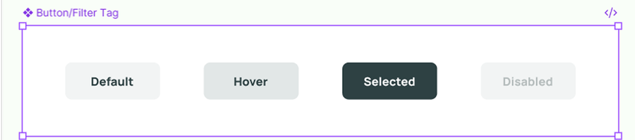
Design System: Standardized buttons, property cards, dropdowns, and info rows in Figma, complete with usage rules and interactive states.
-
5
Webflow Build: Rebuilt the navigation, layouts, and global components directly in Webflow, turning the Figma library into live production code.
Before and After
Drag the handle on each comparison.
Top Navigation Bar - Web
The double logo is gone. The dropdown menu language switcher is right under the collection logo, as a part of it.


Footer - Web
The Certifications & Partnerships are very important and a key selling point for a ski resort like Faern. I redesigned the footer to feature them there, apart from designing the separate page dedicated to those.


Homepage - Mobile
The homepage for Arosa (but the other 3 properties as well) had overflowing text in the hero, and the collection logo with the Arosa logo stacked on top of eachother, fixed that for readability and clarity.


Footer - Mobile
Broken top navigation bar and broken footer that contains key links to properties, turned into a well structured navigation bar and footer that is fully visible.


Components & Design System Documentation
The buttons, filters, sliders, and other components like property cards, amenity rows, were inconsistent so I rebuilt those, as they immediately affect navigation, user experience and conversion rates, as visitors can’t fully see things like: events happening at the spots, full amenities packages, etc.


What I'd take forward.
Design systems earn trust slowly
Standardizing five sites at once meant every component decision had to hold up across brands, not just one property. That constraint made the library stronger than if I'd designed for a single site.
Audits need a priority lens
Fifty pages of broken UI is overwhelming without a way to rank fixes by impact versus effort. Partnering with execs and marketing early kept the build from stalling on low-value polish.
You can see the live sites at faernresorts.com, or reach out for more on how this was scoped and shipped.